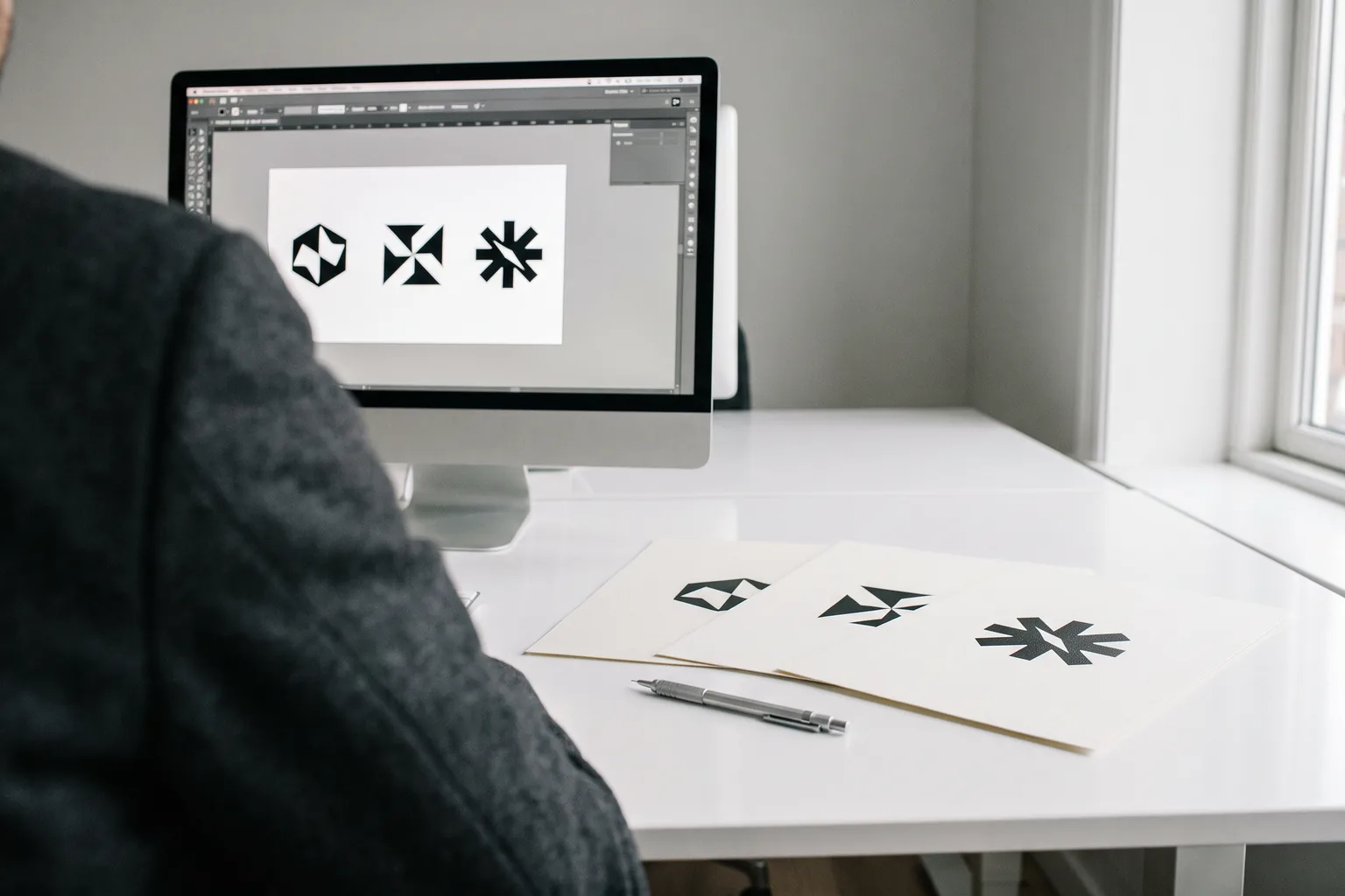
Most business owners think about changing their logo at the wrong moment. Usually when sales drop or when they're simply bored of it. In both cases a new logo won't fix anything.
There are situations, though, where an old logo genuinely costs you customers. Below is how to recognise them, and how to make the change without binning five hundred business cards.
Six signs your logo has stopped working
1. It disappears at a small size
Check how your logo looks as a Facebook profile picture, an icon in Google Maps or embroidered on a T-shirt. If a 3 cm circle leaves an unreadable blob, the logo was designed for a shop sign, while today most people see you on a phone screen.
2. You don't have a vector file
Only have a JPG pulled from your website or Facebook? That's not yet a reason to change the logo, but it's a warning sign. Without a vector, every larger print (a banner, a van wrap, a sign) comes out blurry or needs the file recreated from scratch.
Before ordering a new logo, ask about just recreating the vector. If the logo works and the only problem is the file, that's a much cheaper solution.
3. The business does something different today
You started with tyre changes and now do detailing and ceramic coatings. A logo with a wheel and a spanner tells customers they've found a tyre shop. When the scope of the business has changed, the logo has to show what you sell now.
4. It looks like a template
Do an image search for your industry plus the word "logo". If you see several marks almost identical to yours (the same house with a roof, the same drop, the same leaf), customers can't tell them apart either. Especially in industries where everyone uses the same symbols: construction, cleaning, hairdressing, accounting.
5. You're aiming at more expensive clients
You've raised prices, you serve businesses instead of individuals, you bid for tenders. If the logo looks like it took twenty minutes, a client with a bigger budget assumes the service is rushed too. It isn't fair, but that's how first impressions work.
6. Every medium looks different
On the business card the logo is blue, on the website navy, on the van turquoise and on Facebook stretched. It's the most common problem I see, and it usually doesn't need a new logo. It needs rules: one colour palette, one font and one file everyone uses.
When changing your logo is a waste of money
The logo is readable, you have a vector, customers recognise it, and the problem is messy colours and fonts. You order a brand book for 590 PLN and tidy up your materials with the next orders.
You're bored of the logo, so you order a new one for 1,500 PLN, then reprint business cards and flyers and rewrap the van. Customers who've known you for years aren't sure for six months whether it's the same business.
You're bored of it. You see your logo every day, for years. Customers see it a few times a year. What feels stale to you is only just becoming recognisable to them.
A competitor changed their logo. Their change isn't a reason for yours. If their new logo is better and yours passes the six points above, keep it.
Sales dropped. The logo is rarely the cause. More often it's a lack of visibility in Google, out-of-date photos or no reviews. A new logo with the same problems gives the same result, just with a new mark.
Fashion. Flat, minimalist, gradients: styles change. A good logo doesn't need to chase trends, because it wasn't built on them.
A refresh or a new logo
If the signs in the first part apply, you still have to decide how deep to go.
| Refresh | New logo | |
|---|---|---|
| What changes | Proportions, line weight, font, colours, simplified details | Everything, from the concept |
| What stays | The recognisable shape, the main colour, the character | Usually just the name |
| When to choose | The logo is known but looks dated or doesn't work small | The scope of the business changed, the logo is a template or nobody associates it with you |
| Risk | Small: regular customers still recognise you | Bigger: for a while you rebuild recognition from scratch |
| My price | from 1,000 PLN | from 890 PLN |
A refresh isn't cheaper than a new logo, which often surprises people. With a new mark I have a free hand. With a refresh I have to keep what people recognise you by and fix what doesn't work at the same time. That's a harder job, not an easier one.
The full scope and prices for logo design are on the logo design page.
How to change your logo without overpaying
The biggest cost of changing a logo isn't the design. It's replacing everything the old logo already appears on.
Before you decide, list your materials:
Then replace them in this order:
Digital first. Profiles, website, email signature, document templates. It only costs time, and customers immediately see the new mark where they look most often. When you change the profile picture on your Google Business Profile, add new photos of the business too; it's a good opportunity.
Then print, but only when it runs out. Don't throw away your stock of business cards and flyers. Order new ones when the old ones run out. For a month or two the old and new logos will be in circulation side by side and nothing bad will happen.
Shop sign and van last. These are the most expensive items. With a van wrap it often pays to wait until the old vinyl needs replacing anyway.
If your logo is registered as a trademark, a clear change in appearance usually means a new application. Protection covers the registered form of the mark. Talk to a patent attorney before changing it.
What you must get after changing your logo
Whoever makes your new logo or refresh, at the end you must have:
Without that, in two years you'll be back at point two of this list. More on what to check with a designer before you pay them in how to choose a logo designer.
Not sure whether your logo needs a change, a refresh or just tidier files? Send it to me and I'll tell you honestly what to do, even if the answer is: leave it.
Send your logo for reviewIf it turns out the logo is fine and the problem is a lack of rules, see brand identity for a small business.
FAQ
How much does a logo refresh cost?
With me a refresh of an existing logo starts at 1,000 PLN. A new logo in three versions starts at 890 PLN, and a logo with a mini brand book is 1,190 PLN. On top of that comes replacing your materials, but that can be spread over time.
Will changing the logo hurt the business?
It can, if you change a well-known logo to a completely different one overnight. That's why with a known logo I usually recommend a refresh rather than a new mark. Regular customers still recognise you and new ones get a more modern look.
How often should a business change its logo?
There's no set interval. A good logo can last ten, twenty years or longer. You change it when it stops working (it doesn't work small, doesn't fit what you do, or looks like a template), not because a few years have passed.
Do I have to notify any office after changing my logo?
A logo isn't recorded in the Polish business registers (CEIDG or KRS), so nothing changes there. The exception is a logo registered as a trademark: then a clear change in appearance usually requires a new application.
I only have my logo as a JPG. Do I need a new one?
Not necessarily. If the logo works, it can be recreated as a vector. I quote that after seeing the file, as it depends on how complex the mark is. A new logo only makes sense if, besides the missing file, one of the other signs applies.
What's the difference between a logo refresh and a rebrand?
A refresh modernises the mark itself while keeping what people recognise it by. A rebrand is a wider change: a new logo, colours, tone of voice and sometimes even the name. Most small businesses that say "I need a rebrand" actually need a refresh and tidier materials.